Relationships
Value and Temperature
Light against dark, warm against cool, and the quiet colors in between
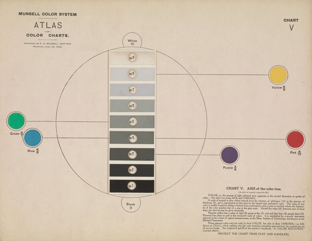
Before it is a set of hues, a painting is a pattern of lights and darks. This module looks at that pattern, at the pull between warm and cool, and at the grays and browns that hold a picture together. Each idea is paired with a painting that depends on it.
- Reading lights and darks across different hues
- Temperature as a comparison rather than a fixed label
- Grays mixed from opposites, and pigments dug from the earth
- Key
- A picture's overall value range: high key is mostly light, low key mostly dark.
Works in this part
Image: Smithsonian Libraries via Internet Archive · Public domain