Concept · Relationships
Itten's Seven Contrasts
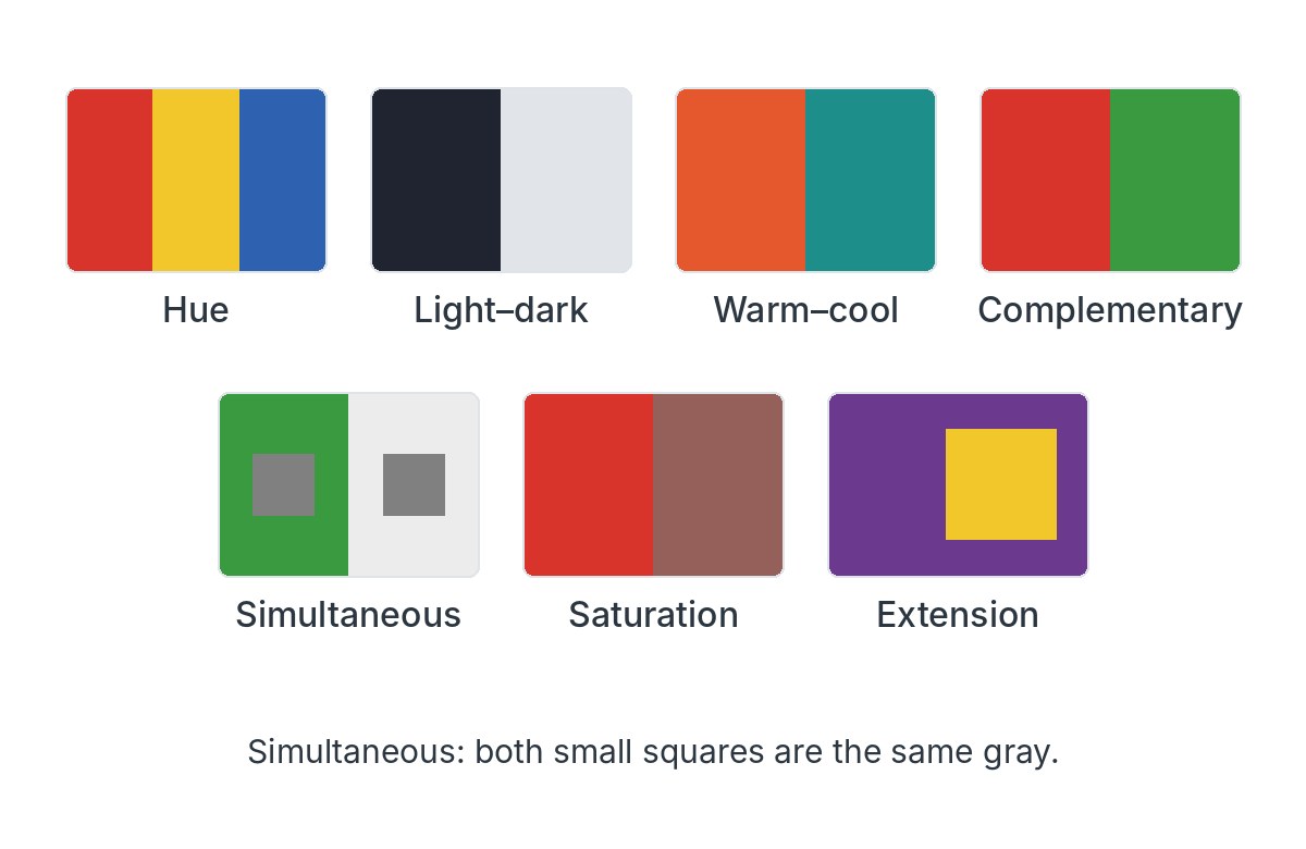
Johannes Itten sorted the ways colors can differ into seven contrasts: hue, light and dark, warm and cool, complements, simultaneous contrast, saturation and extension.
The list works best as a checklist for looking, not a rule book. Complements appear above, light–dark and warm–cool in Value and Temperature, and simultaneous contrast in Interaction; the last two follow here.
- Hue contrast is plainest when hues sit far apart on the wheel at full strength, as in a triad.
- For any two passages in a painting, ask which of the seven differences are doing the work.
- The seven overlap: a red beside a green differs in hue and often in value at once.
Image: Made for this site · Original work