Concept · Relationships
Contrast of Saturation
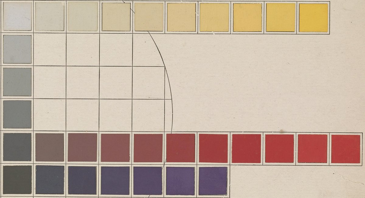
This contrast sets pure, intense colors against dull, grayed ones.
An intense color looks stronger among muted ones and weaker among other intense colors. Painters use this to decide where the eye lands without changing hue or lightness. Since mixing rarely raises intensity, dulling the surroundings is often the easier route.
- It needs no second hue: Munsell's red, stepped from gray to full strength, already contrasts with itself.
- Painters gray down most of a picture so a few saturated passages can carry the focus.
- Making every color intense backfires: when everything shouts, nothing stands out.
See
Image: Smithsonian Libraries via Internet Archive · Public domain