Concept · Relationships
Transparency and Space
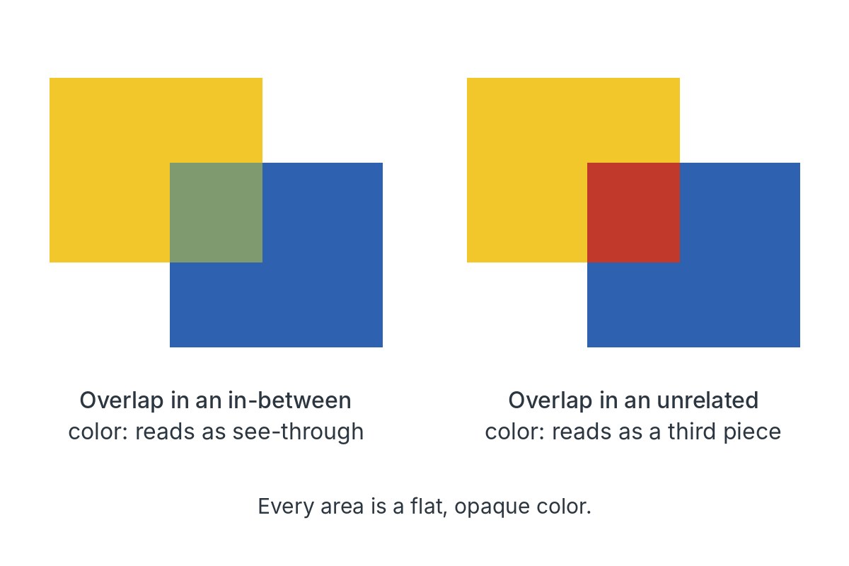
Flat, opaque colors can look like overlapping sheets of tinted glass when the shared area is painted in a color between the two.
The eye reads the in-between color as one sheet seen through another, so a flat design gains layers and depth. If the overlap looks more like one of the two colors, that color tends to seem on top and come forward.
- Compare the right-hand pair: an unrelated color in the overlap breaks the illusion at once.
- Painters and designers use it to suggest veils, water or tinted light without real glazes.
- Albers's name for the in-between color is the middle mixture.
Image: Made for this site · Original work